- Asia
- Brand Localisation
- Brand Guidelines
- Retail Design
- Fresh Produce
Brand localisation for Asian markets: making Australian Grapes instantly recognisable across Asia.
- CLIENT
- Australian Table Grape Association (ATGA)
- Market
- South East Asia (7 languages)
- ChannelsMoment
- Online & Offline Applications
- Services
- Brand Strategy, Design Adaptation
Results at a glance
- Project Phases
- 3
- Language Systems
- 7
- Regional Colour Palettes
- 3
- Co-branding formats for partners
- 5
- Retail print applications
- 7
Evolving a well-loved logo, not replacing it.
Australian Table Grapes Association (ATGA) needed brand localisation for Asian markets that would let one industry logo work harder across many countries, languages and partners. Australian Grapes is the category marketing brand for all Australian table grapes, owned by Hort Innovation. ATGA is authorised to use and develop it to support grape exports to markets including China, Japan, Korea and Southeast Asia.
The logo was well received and didn’t need changing. But in non-English-speaking markets it wasn’t instantly read as “Australia + Grapes”, which is the brand’s most important message. Materials from the 2024 promotion programme also showed how quickly the look could become inconsistent across countries and partners. And because the brand belongs to a whole industry, growers without strong brands of their own needed a simple, rule-based way to co-promote with it.
- Category
- Fresh produce: Australian table grapes
- Audience
- Asian consumers and retailers, plus Australian growers and export partners
- Format
- Brand strategy, adaptation guide and retail print set
- Objectives
- Make “Australia + Grapes” clear in every market · build a consistent, flexible brand system · enable growers and partners to co-brand
A brand system built for every market and every partner.
Brand Catalyser worked across three phases: a strategy proposal grounded in market and competitor research, an international adaptation guide, and a ready-to-print retail set for Asian sales channels.
Strategy and benchmarking
3 export brands benchmarkedWe started with a market overview of Australian grapes in APAC and audited how the brand was being used across websites, social media, retail materials and events in Thailand, China and Malaysia. The audit found inconsistent logo use, colours and templates. We then benchmarked three competing grape-exporting brands: Japan’s J-FEC: a government-backed “Japan-grown Fruit” label and a Hello Kitty partnership Korea’s K-grape: a joint export brand with consistent colour and content localised for each country South Africa’s SATI: a dedicated Chinese-language logo for mainland China Two mood boards set the creative direction: “Natural Elements, Quality of Australia” and “Arts & Culture of Australia”.7 languages
230 creatorsWe kept the existing logo and built a system around it: Multilingual logo: adaptations in Chinese, Japanese, Korean, Thai, Indonesian, Vietnamese and English, with spacing rules and do’s and don’ts for phonetic scripts versus character-based scripts like Chinese Regional colours and type: colour palettes for three territories and a typography hierarchy for each language Supporting graphics: USP icons, supplementary graphics and layouts Co-branding rules: lockups where horizontal partner logos sit at 80–100% of the Australian Grapes logo’s height and vertical logos at 80–120%. A clear-space rule is measured from the logo’s own grape circle.
- 01Strategy
- 02Adaptation guide
- 03In-market materials
One industry brand, ready for every market.
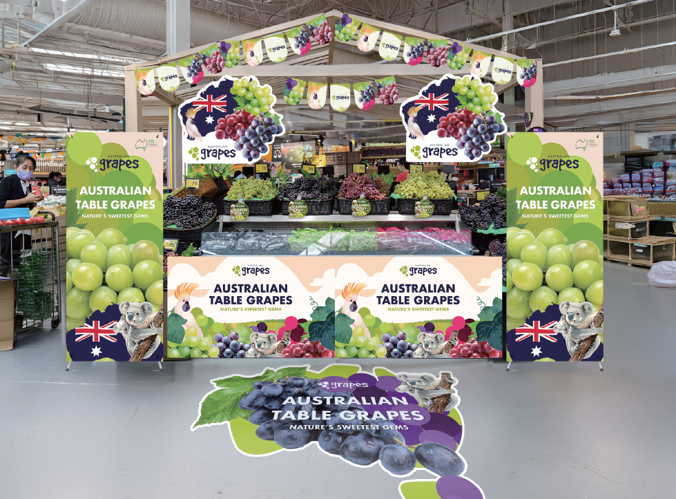
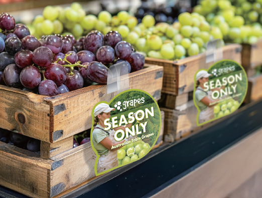
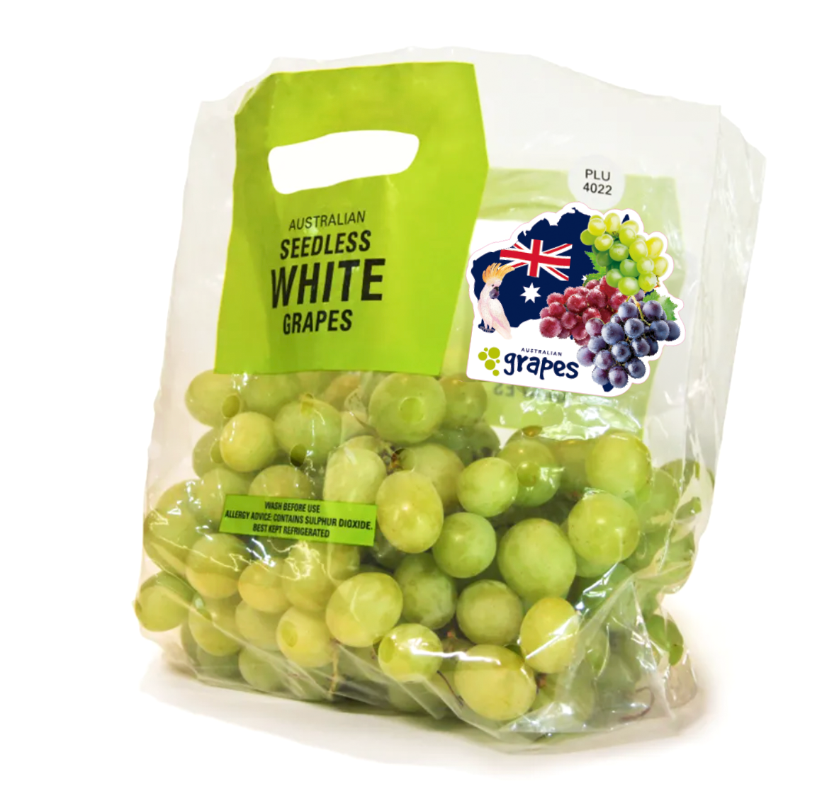
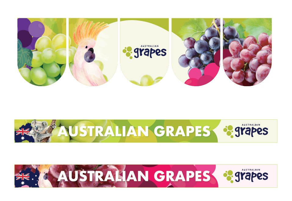
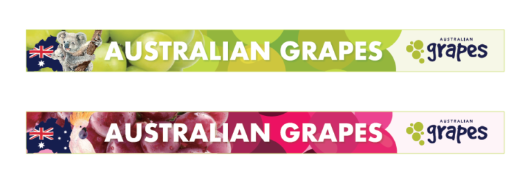
ATGA now has a brand system that keeps the logo it already loved and makes it work far harder. “Australia + Grapes” is clear in seven languages. Signature Australian animals, the flag and the map of Australia make the country of origin obvious at a glance, even where English isn’t read. The retail print set was produced for [market / retail partner], giving the brand a consistent presence on shelf, from a large-format key visual down to the stickers on each pack.
Just as importantly, the co-branding rules mean growers, retailers and associations can put their logos alongside Australian Grapes without breaking its look. The system is ready to become the online asset library ATGA plans for partners to download and print from themselves.
- Languages
- 7
- Colour palettes
- 3
- Co-branding formats
- 5
- Retail applications
- 7
- Key takeaway 01
Evolve before you rebrand
A well-known logo can travel further with a system around it, without starting again.
- Key takeaway 02
Make origin impossible to miss
In non-English markets, visual cues like animals, flags and maps say “Australia” before the words do.
- Key takeaway 03
Rules make a brand shareable
Clear, measurable co-branding rules let a whole industry use one brand consistently.
See the campaign come to life.
In their words.
Brand adaptation is always a hard project, but Brand Catalyser made it easy. They understood exactly what we needed and what works best in each of our Asian markets, and the guide has become a great tool for working with our in-market partners.