- Brand Strategy
- Hort Innovation
- Event Branding
- Gala Dinner
- China Market
Australian Harvest, Chinese Table: event branding for Hort Innovation’s Shanghai gala dinner.
- Client
- Horticulture Innovation Australia
- Market
- China — Shanghai
- PeriodMoment
- 2026 Aug
- Services
- Brand Strategy, Event Production
Results at a glance
- turn around time
- 2 weeks
- collaterals
- 28 Sets
- positive feedback
- 100%
Bringing Australian produce to a Shanghai gala dinner, the Chinese way.
Hort Innovation needed event branding in China that would present Australian horticulture to senior industry leaders, government officials, importers and trade representatives at a gala dinner in Shanghai. Held as part of the China–Australia Horticulture Showcase, the evening combined dialogue and dining around premium Australian fruit, vegetables and nuts.
The event followed a successful Japan Showcase gala in Tokyo, so the creative had to stay recognisably part of the series under the Australian Government’s Nation Brand green and gold system, while feeling distinctly Chinese. With red off the table, the cultural cues had to come from motif, pattern, bilingual typography and composition, not colour.
- Category
- Government Business Event
- Audience
- Senior industry leaders, government officials, importers and trade representatives
- Occasion
- China–Australia Horticulture Showcase Gala Dinner, Shanghai
- Objectives
- Position Australian produce as premium · build trade relationships · create a China identity that sits within the Nation Brand Showcase series
A Chinese visual language, built inside the Nation Brand.
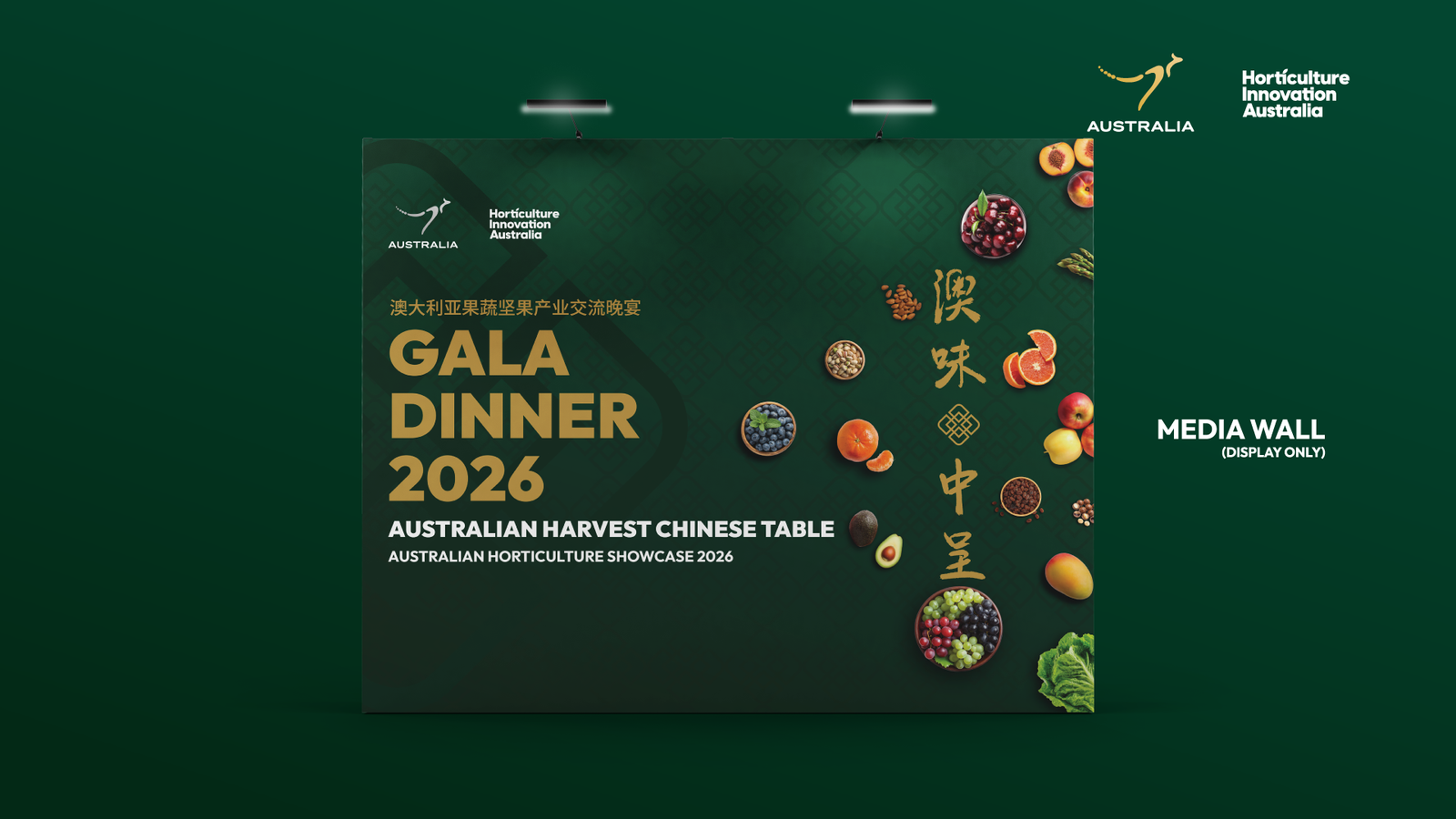
We created the “Australian Harvest, Chinese Table” (澳味中呈) Key Visual, then rolled it out across every guest touchpoint, from the first invitation email to the menu on the table.
Key Visual development
1 identity systemWhere the Japan event was centred and circular, we went asymmetric and square. Vertical Chinese text, a seal-style chop motif, gold corner brackets inspired by traditional window patterns (窗花), a subtle lattice texture and auspicious cloud (祥云) details gave the design its Chinese character, all within the dark green and gold palette. Premium produce photography anchored the visual and was composed to work from email banner to large-format backdrop.Collateral rollout
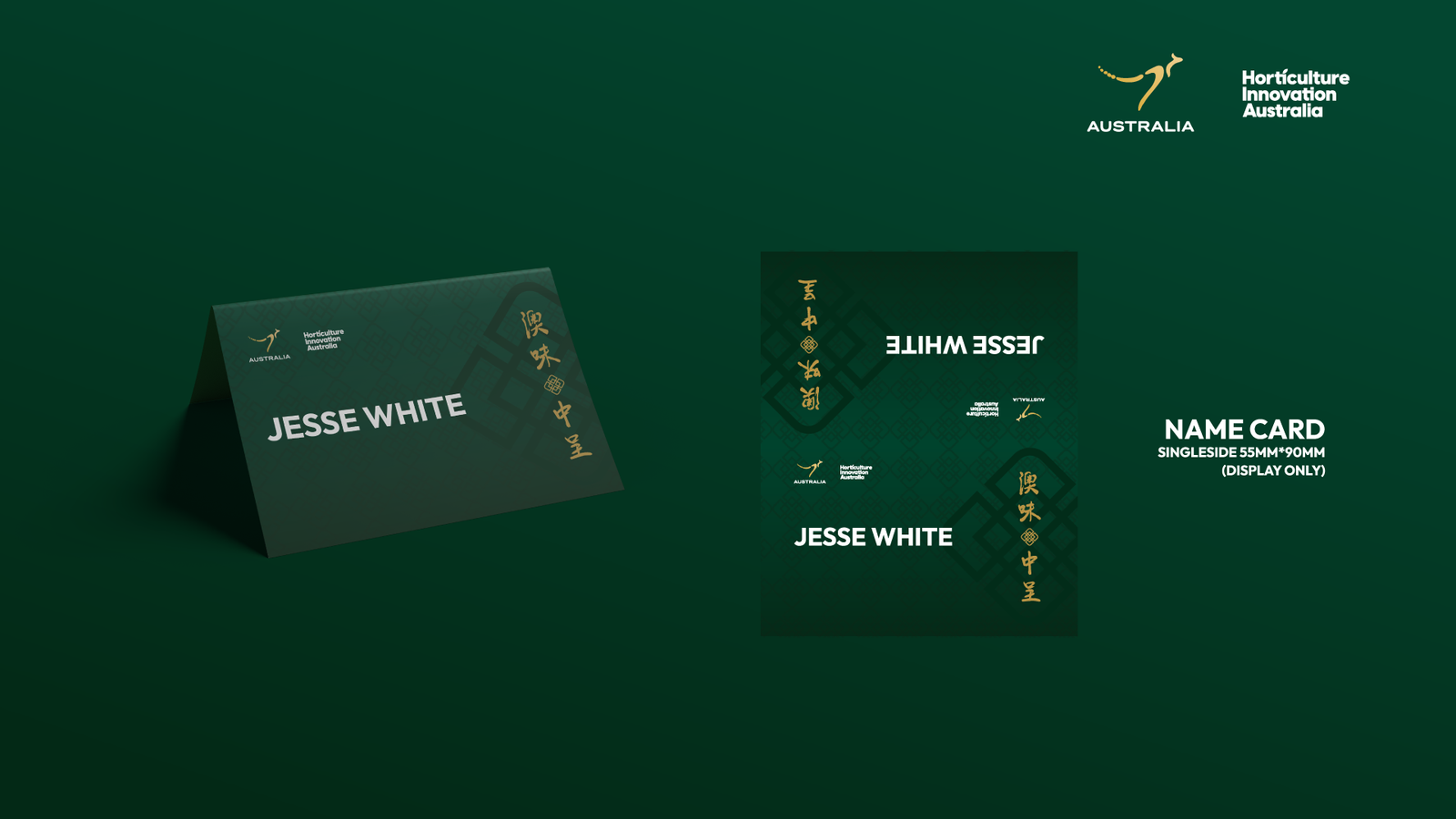
12 touchpointsEmail invitation and reminder, photo backdrop, welcome display with produce installation, branded tablecloth, bilingual place cards, menu cards, table numbers, event program, venue screen slides, and WeChat and LinkedIn graphics — all bilingual and all co-branded with the Nation Brand and Hort Innovation.
- 01Key Visual
- 02Rollout
- 03Production
- 04Event Day
One series, two markets, a distinctly Chinese table.
The gala gave Australian horticulture a premium, unified presence in front of China’s senior trade and government audience. Produce sat at the heart of both the design and the room, so the venue itself became a showcase for the category.
The Key Visual proved the Nation Brand system can flex across markets without losing consistency. Guests in Shanghai saw an event that felt designed for them, while Hort Innovation gained a second chapter in a Showcase series that holds together visually from Tokyo to Shanghai. Delivered in around six weeks from brief to event day, the system covered every touchpoint from inbox to dinner table.
- guests
- 100+
- Touchpoints
- 12+
- languages
- 2
- weeks turnaround
- 2
- Key takeaway 01
Culture through form, not colour
Vertical text, seal motifs, window brackets and lattice patterns made the design unmistakably Chinese without stepping outside the green and gold palette.
- Key takeaway 02
Consistent across the series
Building within the Nation Brand system let the China event stand on its own while clearly belonging alongside the Japan Showcase.
- Key takeaway 03
One system, every touchpoint
A single Key Visual, designed for multiple formats from the start, carried cleanly from a 600px email to a three-metre backdrop.
Step inside the Gala Dinner.
In their words.
Brand Catalyser were super efficient and always got exactly what I wanted. Very creative, they brought Chinese elements into the design at the perfect pitch.